
Din Din
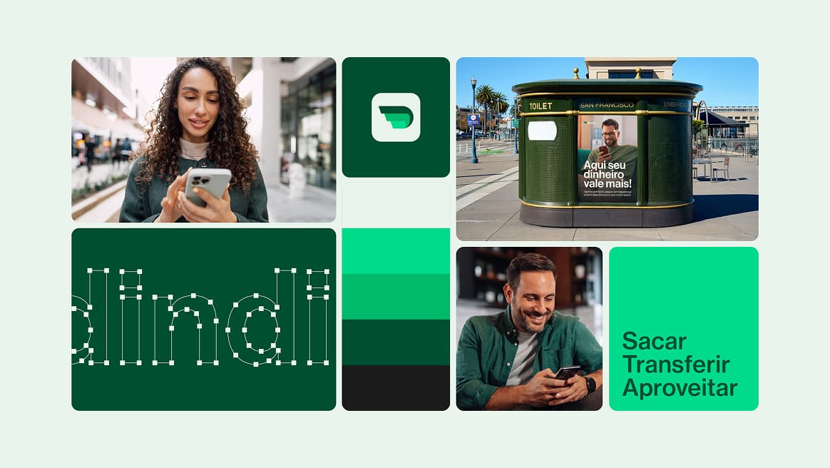
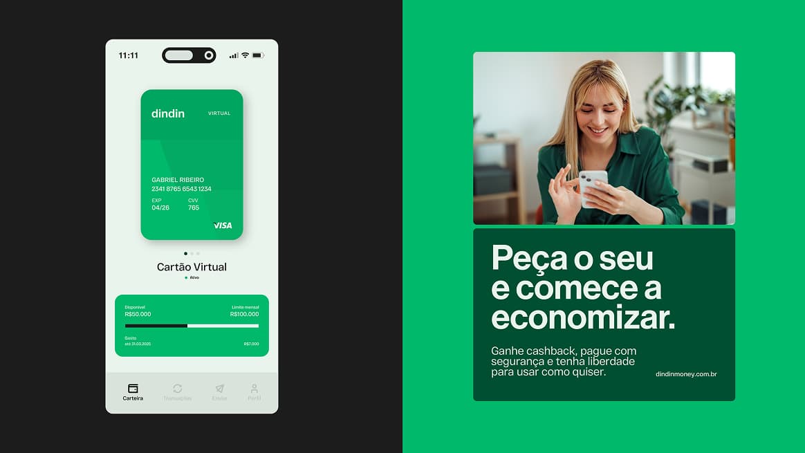
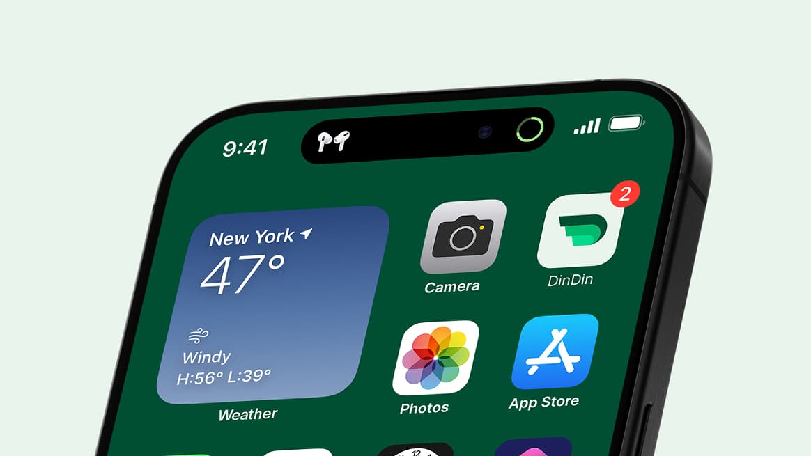
We are proud to introduce the new visual identity of DIN DIN MONEY CARD designed to reflect a modern, ethical, and user-centered approach. This new branding reinforces our commitment to transforming the employee benefits card market in Brazil.
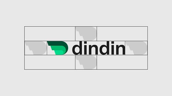
The Din Din logo is the cornerstone of our visual identity, symbolizing the trust and reliability the brand stands for. With clean lines and precise typography, the design strikes a balance between classic and contemporary a direct reflection of our positioning: simple, accessible, and transparent.
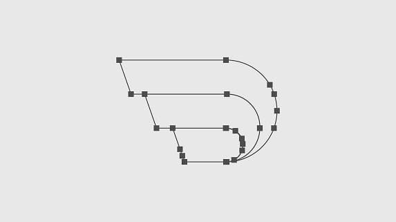
Logo Structure
The visual structure was designed to express Din Din’s core values: security, commitment, and customer respect. With a minimalist and timeless style, the new identity strengthens the brand’s digital presence and builds strong connections across diverse audiences from end users to corporate partners.
Thank you!
Let’s talk about your sales process.
A question, or would you like to book your diagnosis? Leave your details: we get back to you within 24 business hours.
- 01
Fill in the form
Your details and your question. Your information stays protected.
- 02
We call you back
Within 24 business hours, to answer or to book your diagnosis.