
We proudly present the visual identity developed for MH, a brand that brings together engineering, investments, and architecture in a solid, modern, and strategic positioning. The new identity accurately conveys the brand’s pillars: structure, stability, and growth, reflecting its role as a trusted agent in transforming capital into progress.

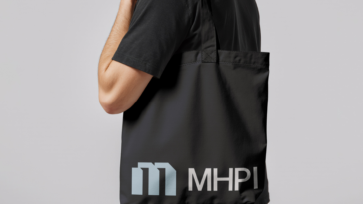
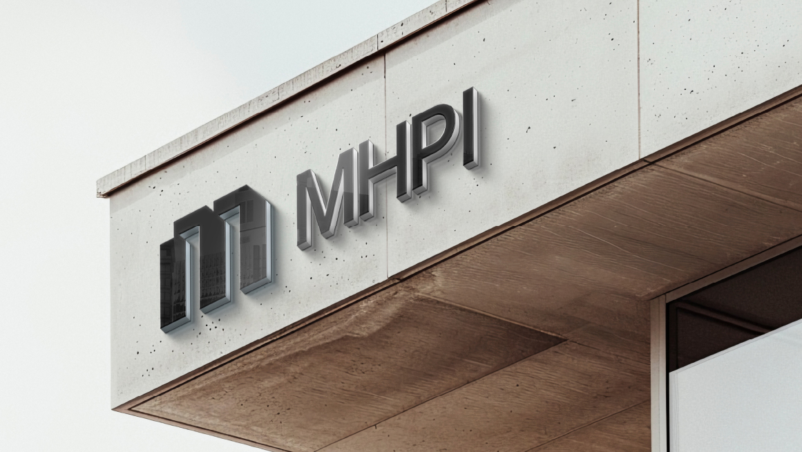
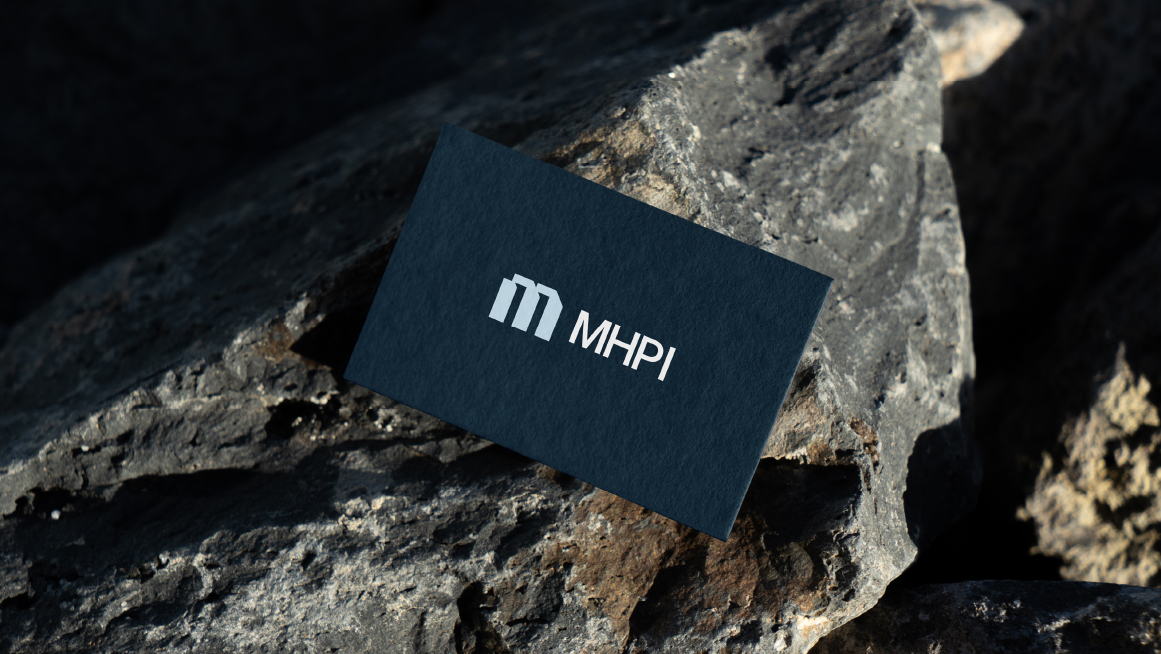
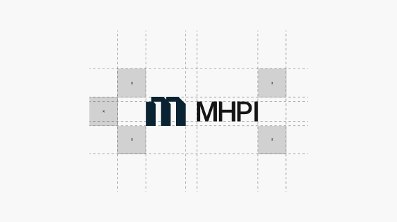
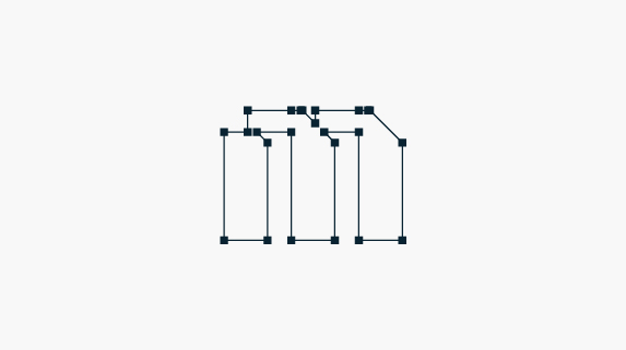
The MHPI Sàrl logo is anchored in an architectural “M” symbol, composed of robust vertical lines and bold diagonal cuts. This visual construction evokes contemporary architecture and the dynamism of investments, reinforcing the brand’s mission to combine structural solidity with strategic movement.

Logo Structure
The chosen typography complements this concept with sophistication: the uppercase “MHPI” conveys strength and institutional presence, while the lowercase “Sàrl” balances the composition with a touch of authenticity and a nod to its Swiss origin. The result is a logo that communicates professionalism, authority, and local identity.
Thank you!
Contact
Contact us right now!
Fill out the form, and our team will get in touch within 24 hours to understand your needs and offer solutions.
1°
Fill out the form
Send your contact information. All your data will be safe, we’ll take good care of it.

2°
Receive a call
Within 24 hours, one of our specialists will call to schedule the most important meeting with you.